
golf impact screen white vs gray
Golf Impact Screen White vs Gray: Which Color Wins in Your Room?
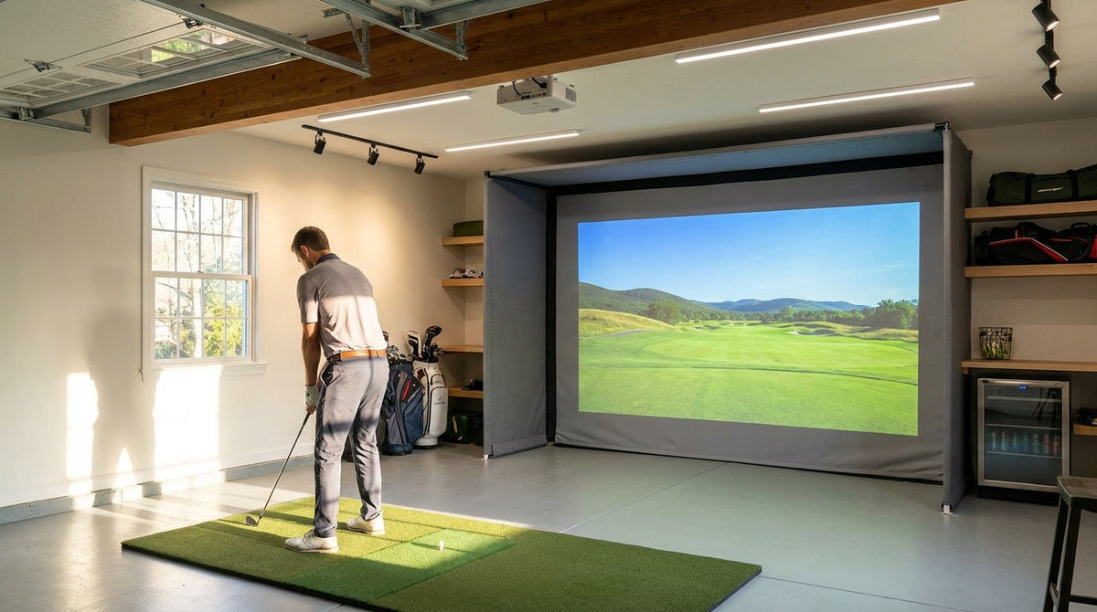
Picture two garage simulators side by side. They have the same projector, the same overhead shop lights left on, and the same triple-layer Premium screen build. The only difference is screen color. The gray one shows roughly 25–30% more contrast, and the white one looks a little washed out (Source: My Golf Simulator).
Now turn the lights off. The white screen suddenly looks brighter and punchier, and the gray one can look a bit dim if your projector is on the weaker side.
That's the whole golf impact screen white vs gray debate in a nutshell. Neither color is simply better. The right pick depends on how much light is in your room and how many lumens your projector puts out. Below you'll find the numbers, clear pick-white-if and pick-gray-if rules, and how each Carl's Place tier handles both cases.
Building one now? Carl’s Place High-Contrast Gray screen — from $450.
White vs Gray Golf Impact Screen: What Actually Changes
A white screen reflects nearly all the light that hits it. That's great for your projector's image. It's also bad news in a bright room, because the screen bounces window glare and ceiling light right back at you too.
A gray screen reflects less of everything. Your projector's image gets a little dimmer, but stray room light gets knocked down even more, so blacks stay darker and colors hold together. That trade-off is what contrast really means on a simulator screen.
Gain: the spec behind the color
Gain measures how much light a screen sends back compared to a neutral reference. White sits around 1.0, and gray is estimated at about 0.6 (Source: Home Performance Lab). If the term is new to you, our golf impact screen gain rating explainer covers why a bigger number isn't automatically better.
Why not just buy an ALR screen?
True ambient light rejecting fabric depends on delicate optical layers that don't hold up to a driver at full speed. Gray impact fabric is the durable middle ground. We break that down in our ambient light rejecting golf impact screen guide.
Deciding between white and gray right now?
Browse Carl's Place impact screens in Standard, Preferred, Premium White, and Premium High-Contrast Gray, in multiple sizes.
Shop Impact ScreensBy the Numbers: What the Data Says About Screen Color
Here's what the research on screen color shows:
- 25–30% more contrast: Gray screens give about 25–30% higher contrast than white when there's light in the room (Source: My Golf Simulator).
- About 40% more room light absorbed: Gray is said to absorb roughly 40% more room light than white. Treat that as an estimate, not a lab result (Source: Home Performance Lab).
- 3,000 vs 2,500 lumens: Gray screens work best with 3,000+ lumen projectors, while white still works with projectors under 2,500 lumens (Source: My Golf Simulator).
- 4,000 and 5,000 lumens: Carl's Place recommends at least 4,000 lumens for rooms with noticeable light, and 5,000+ lumens for a gray screen in a bright room (Source: Carl's Place).
Recommended Minimum Projector Brightness by Screen Color and Room Condition
Source: My Golf Simulator (2,500 and 3,000 lumen guidance); Carl's Place ambient light guide (4,000 and 5,000 lumen guidance). Values in projector lumens.
See the pattern? The brighter the room, the more lumens you need, and gray raises that number again. Gray fixes washout, but it doesn't add brightness. Your projector has to supply that.
Golf Impact Screen White vs Gray: The Decision Rules
Pick white if…
- You can control the light: a windowless basement, blackout curtains, and lights off when you play.
- Your projector is on the lower-output side. White still works under 2,500 lumens, where gray can look dim.
- You want maximum brightness and color pop from the course graphics.
- You're shopping the Standard or Preferred tiers, which only come in white.
Pick gray if…
- You're in a garage with door windows, a side window, or a walk-in door that lets daylight in.
- You leave the overhead lights on so people can see the hitting area, or friends watch from the couch.
- You run a commercial bay where you don't control the lighting.
- Your projector puts out 4,000+ lumens, ideally 5,000+ if the room is truly bright.
The tiebreaker
Stuck in the middle, like a basement with one small window you could cover? Ask yourself one honest question: will the lights really stay off?
If there's a real chance they come on when friends show up, lean gray and make sure your projector can keep up. If the room really stays dark, white gives you the brighter picture.
How Carl's Place Tiers Handle White vs Gray
On Carl's Place screens, color isn't a separate option you add to any tier. Gray only comes in the Premium material, so the white-vs-gray choice really only exists at the top tier (Source: Carl's Place). Every tier is rated for ball speeds up to 250 mph, so durability isn't what sets them apart.
Image quality does. Carl's Place rates Standard as “Good,” Preferred as “Great,” and both Premium White and Premium Gray as “Excellent” (Source: Carl's Place).
How Carl's Place Screen Tiers Handle Image Quality: White vs Gray
Swipe to compare →
| Tier | Image Quality (Carl's Place rating) / Construction | Price Note | Best Fit |
|---|---|---|---|
| Standard (white) | Good; loose open weave with visible texture | Entry tier; check current price | Dark room on a budget with a 4,000+ lumen projector; casual play |
| Preferred (white) | Great; tighter weave for a smoother, sharper HD picture | Mid tier; check current price | Dark or dim room where you want more detail without paying for Premium |
| Premium (white) | Excellent; triple-layer, tightest weave, quieter with less bounce-back | Top tier; check current price | Fully light-controlled room where you want maximum brightness and color pop |
| Premium High-Contrast Gray | Excellent; same triple-layer Premium build in gray for deeper blacks and less washout | About $10–$15 more than Premium White in the same size | Garage, basement with windows, lights left on, or a commercial bay; pair with a 4,000–5,000+ lumen projector |
The gap between Premium White and Premium Gray is small at Carl's Place: about $10–$15 in the same size. At some other brands, going gray can add about $310 in larger sizes (Source: Home Performance Lab). So cost shouldn't make this decision for you. Your room light and projector lumens should. For the full tier-by-tier breakdown, see our Carl's Place Standard vs Preferred vs Premium comparison.
Screen Color Mistakes That Waste Money
Buying gray to fix a weak projector
Gray lowers brightness. A dim projector on a gray screen just gives you a dimmer image. Fix the lumens first, then think about screen color.
Buying white for a sunny garage
You'll get a bright image that looks milky every time the sun is out or the shop lights are on. If you can't control the light, white will fight you every session.
Ignoring light you can control
Before you settle on gray, look at what you can actually change. Blackout curtains over one window or a dimmer on the overhead lights can turn a bright room into a dim one. If that's enough, white may be the better pick after all.
The Bottom Line
Dark room and a modest projector? Go white. Bright room and a strong projector? Go gray. Somewhere in between? Be honest about how you'll really use the space, then match your projector to the screen.
Whichever way you go, the Carl's Place lineup has you covered, from the budget-friendly Standard up to Premium High-Contrast Gray. Shop our impact screens and pick the size and color that fit your room.


Not sure which simulator fits your room?
The two-minute Simulator Finder Quiz checks your space and budget against every system we carry.

Keep Reading
Related guides

golf simulatorGolf Simulator Enclosure Lighting Plan: Where to Mount Fixtures So They Never Wash Out Your Screen

golf simulatorGolf Simulator Basement Conversion Checklist: The 7 Steps to Run Before You Buy Anything

DIY golf simulatorGolf Simulator Garage Build Cost Breakdown: Every Line Item at Three Budget Tiers